Minute Maid packaging and "Phytos for life." icon design
Client: Coca Cola (Japan) Company
Client: Coca Cola (Japan) Company
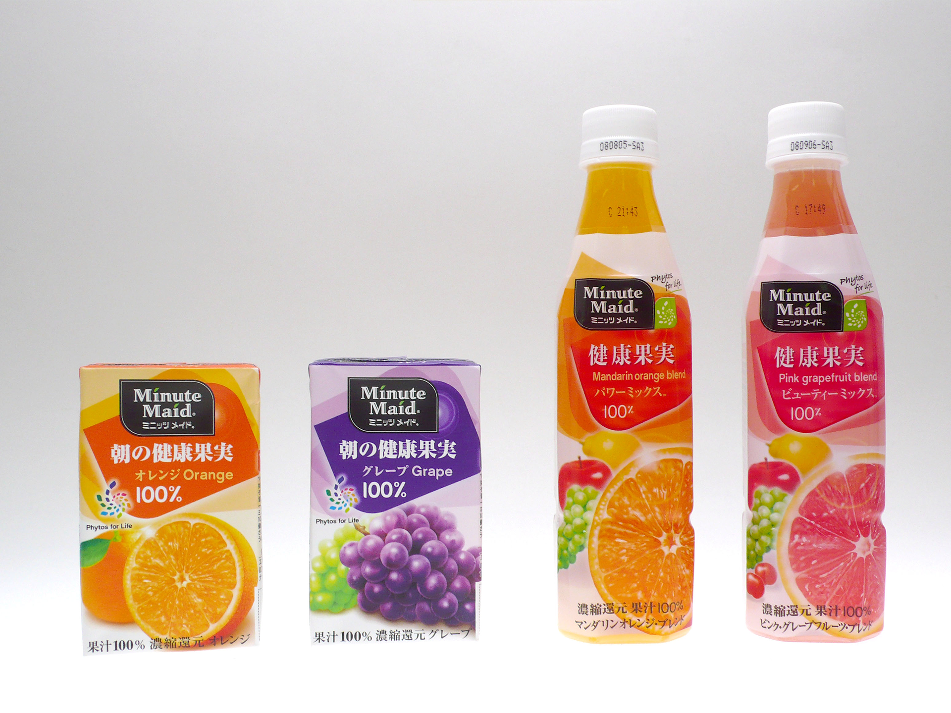
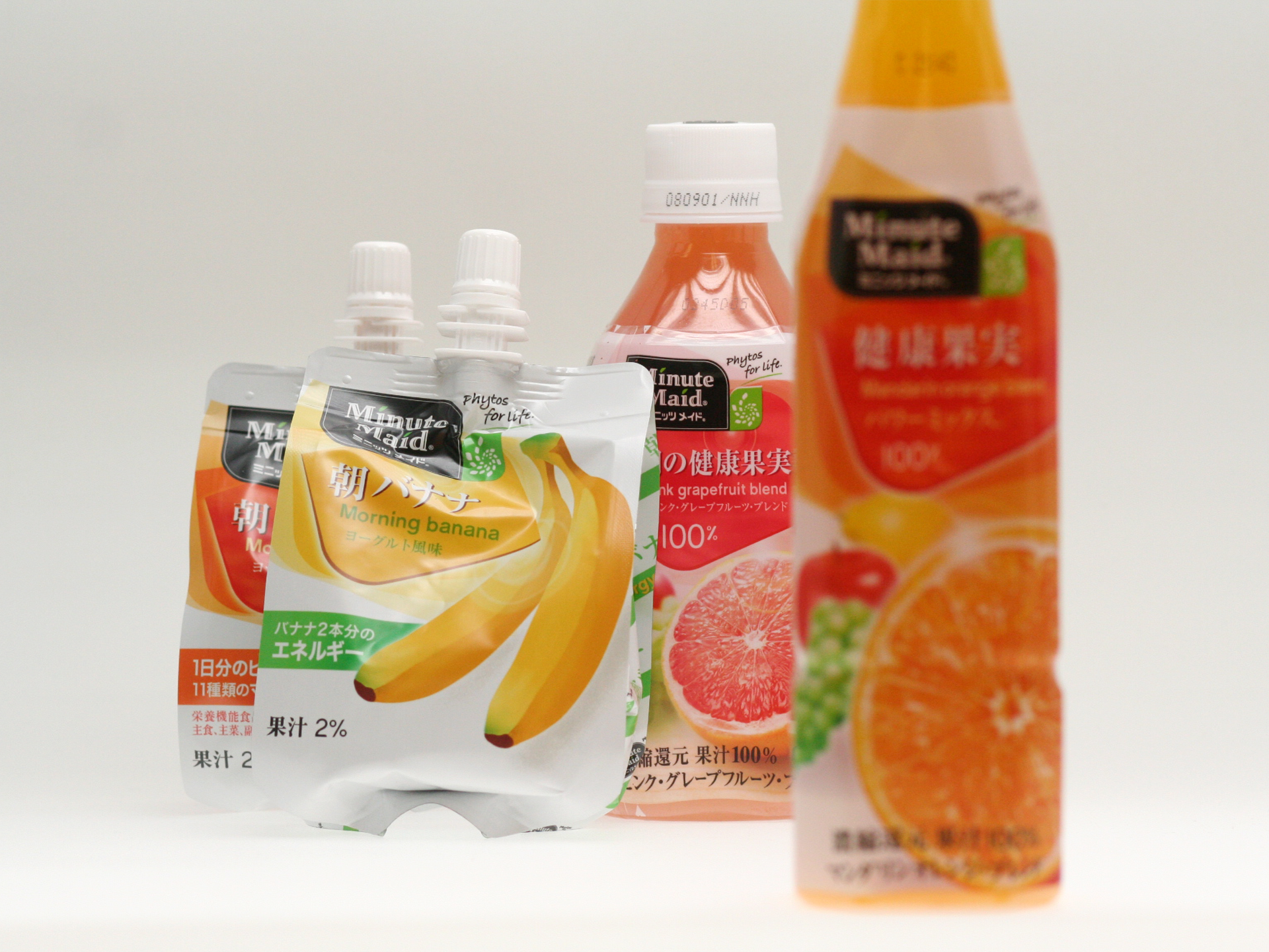
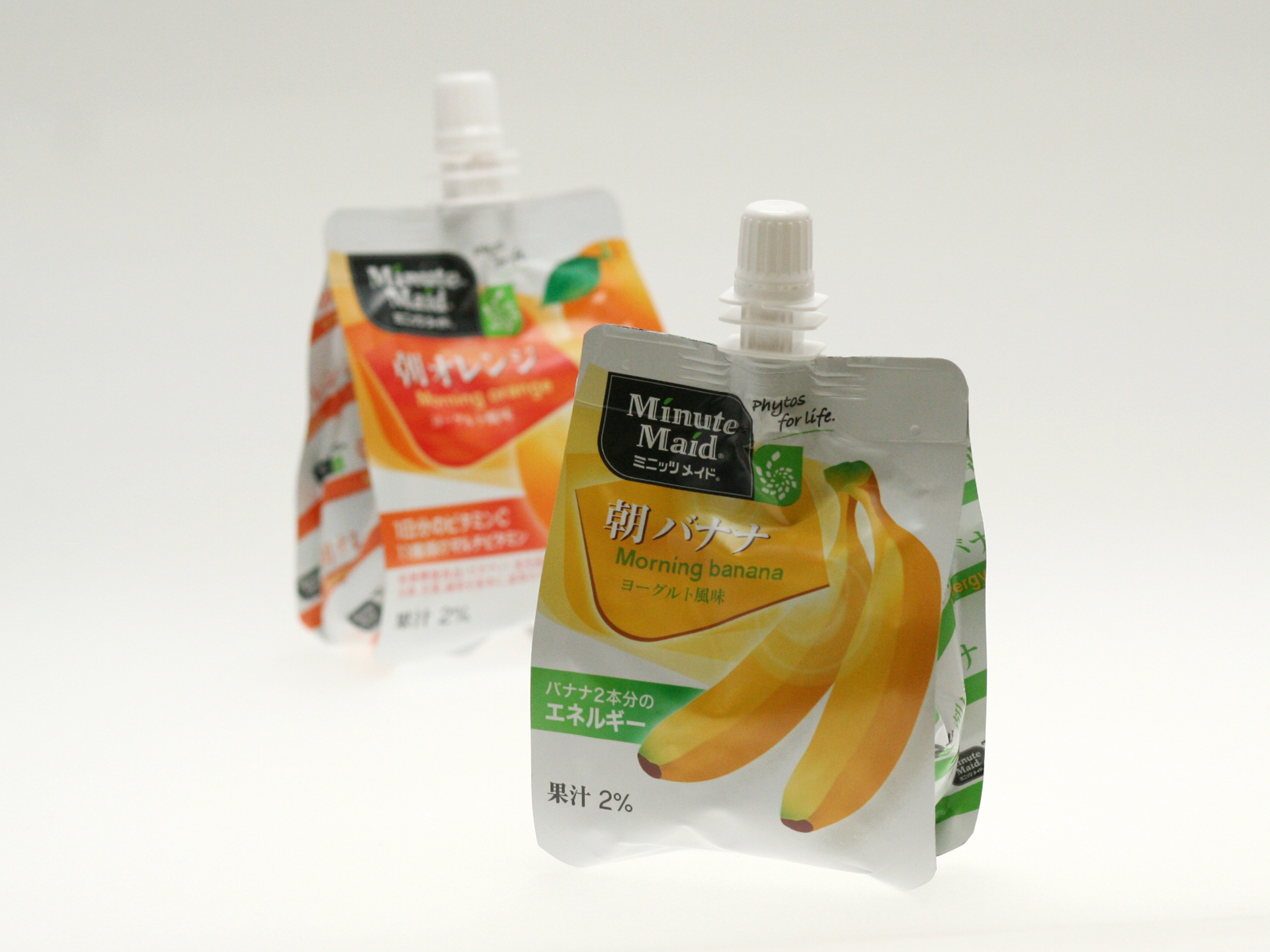
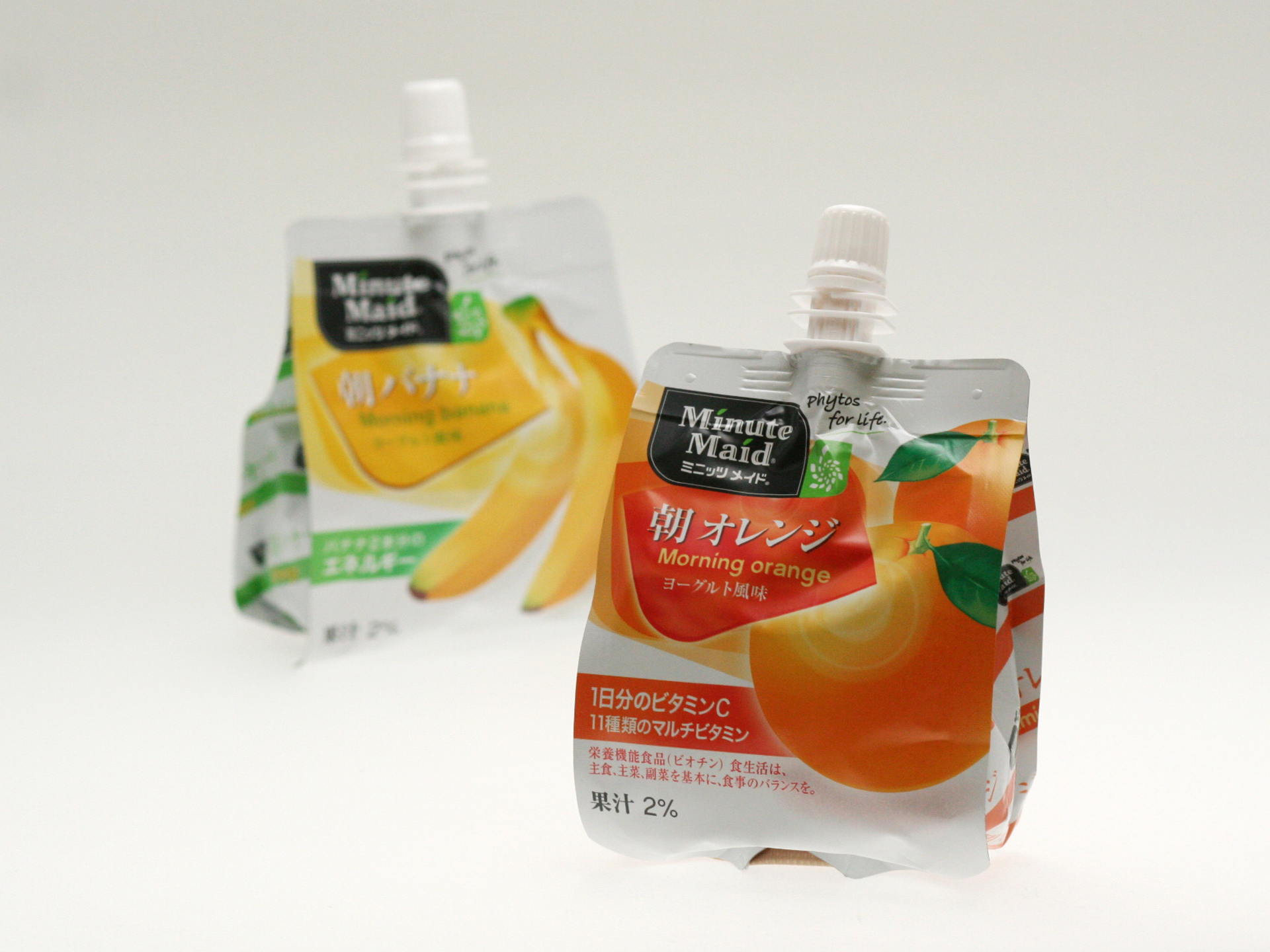
Coca-Cola Japan has engaged The Brand Union to develop packaging design concepts for the research of the new Phytos Nutrient range of juices (for the Minute Maid brand).
A key part of the design thinking is to envision a system of graphic design components that can leap off the packaging into other communication channels, and also look and behave in a manner that relates to the television advertising concepts (one family of thinking)–this includes Phytos iconography and a related visual system.
At all times, the design thinking must ideally reinforce Minute Maid’s visual brand equity and on-shelf recognition in a surprising (yet familiar) visually distinct manner. Designs created initially for orange juices were applied to other flavor’s packaging indicative of the design system’s adaptability.
My Role:
Concept Developments
Design
Client Relationship
Design
Client Relationship
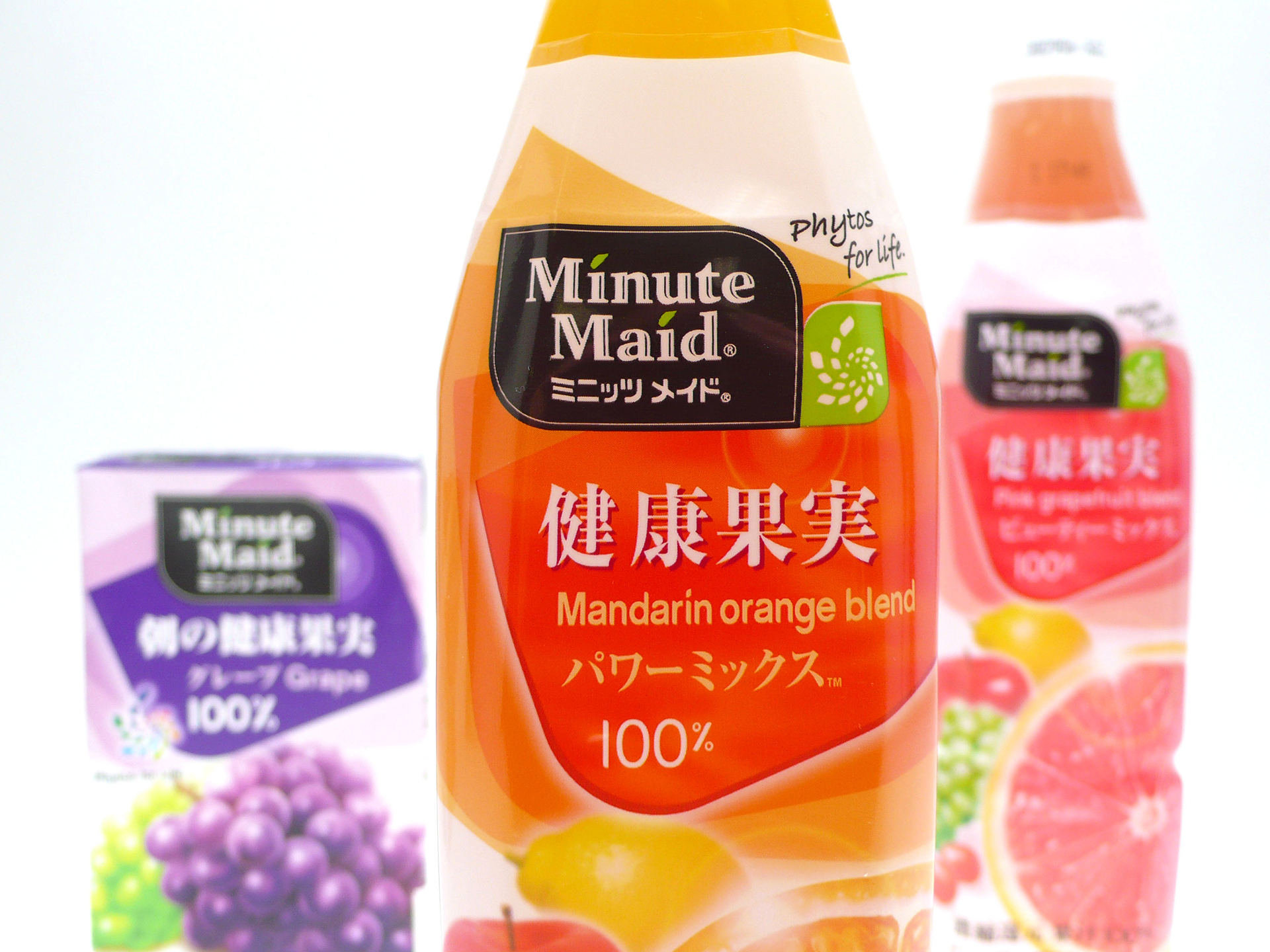
The Phytos icon locked up with Minute Maid logo
Concept
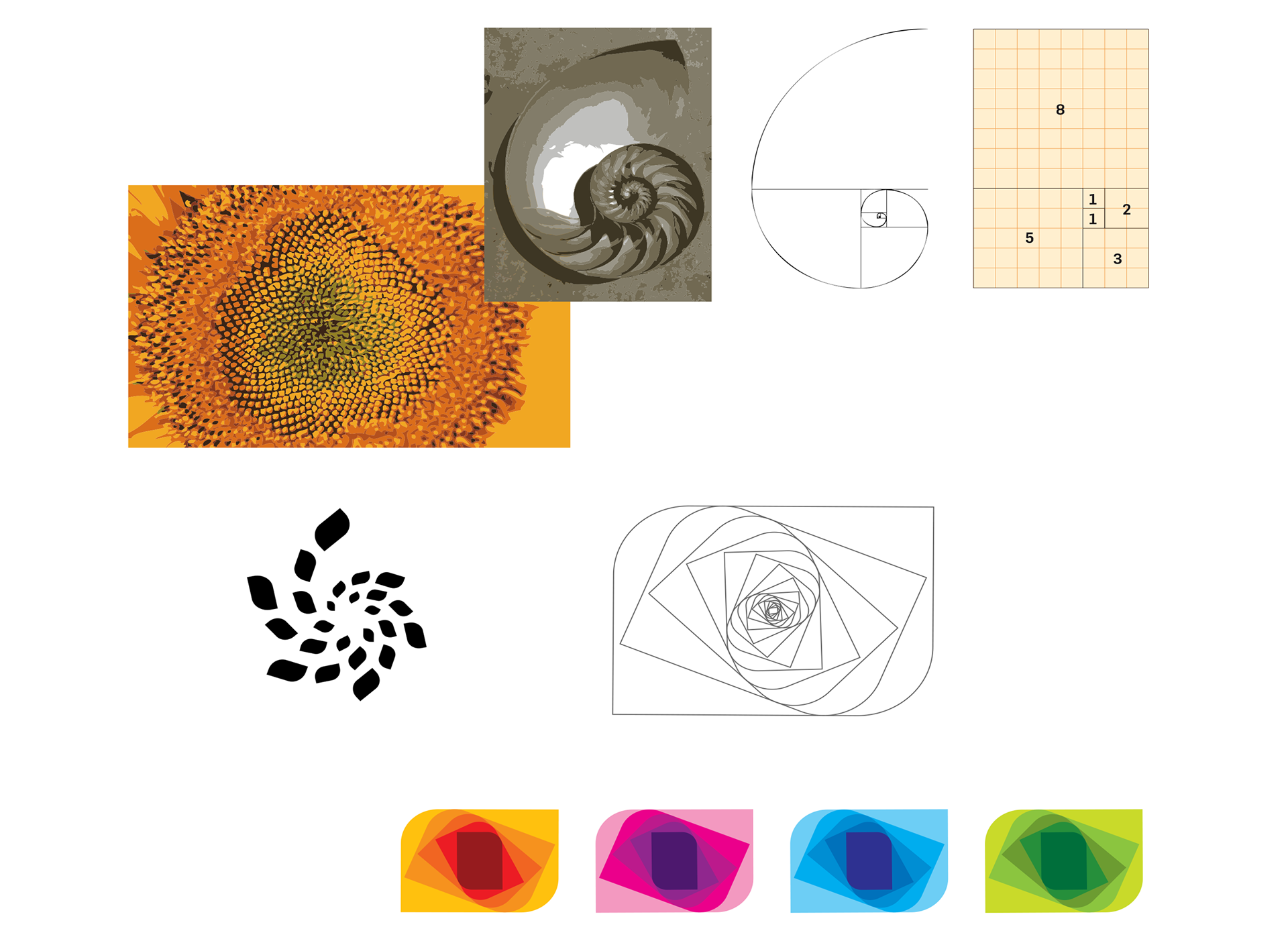
The Fibonacci sequence found in nature was selected to define the key concept behind expressing the Phytos philosophy of “smart wellness” found in natural foods. To this end, we have interpreted this natural spiral mathematical principle as the key visual component of the design system.
The common thread through all the design work is to build on Minute Maid’s graphic leaf device, thereby moving towards a platform for ownable ‘leaf equity’, which will serve to give Minute Maid a dominant leadership position in this relatively new category of healthy eating.
This is also to be said for the Phytos icon. The visual identity system and Phytos icon express not only growth, but the true principle of Phytos: nature’s energy and power can impact our everyday wellness.