Rebranding of business planner brand
Client: JMA Management Center Inc.
Client: JMA Management Center Inc.
Bindex is the business planner brand of JMA Management Center Inc. The request was to create unified visual identity system to strengthen the brand.
Since its launch in 1987, Bindex had no firm consistent look & feel and required a complete overhaul from concept to execution; the only requirement was to incorporate the existing logo type.
Keywords extracted from client audit and interviews were utilized for the project’s foundation. The two main concepts JMA wanted to communicate with Bindex are:
1. Organized, clean, and cool for any business need or situation
2. Cutting edge, flexible, and high functionality to provide perfect solutions
1. Organized, clean, and cool for any business need or situation
2. Cutting edge, flexible, and high functionality to provide perfect solutions
The brand’s goal is to support a professional clientele by providing a variety of products with a recognizable system that can be customized to an individual’s needs.
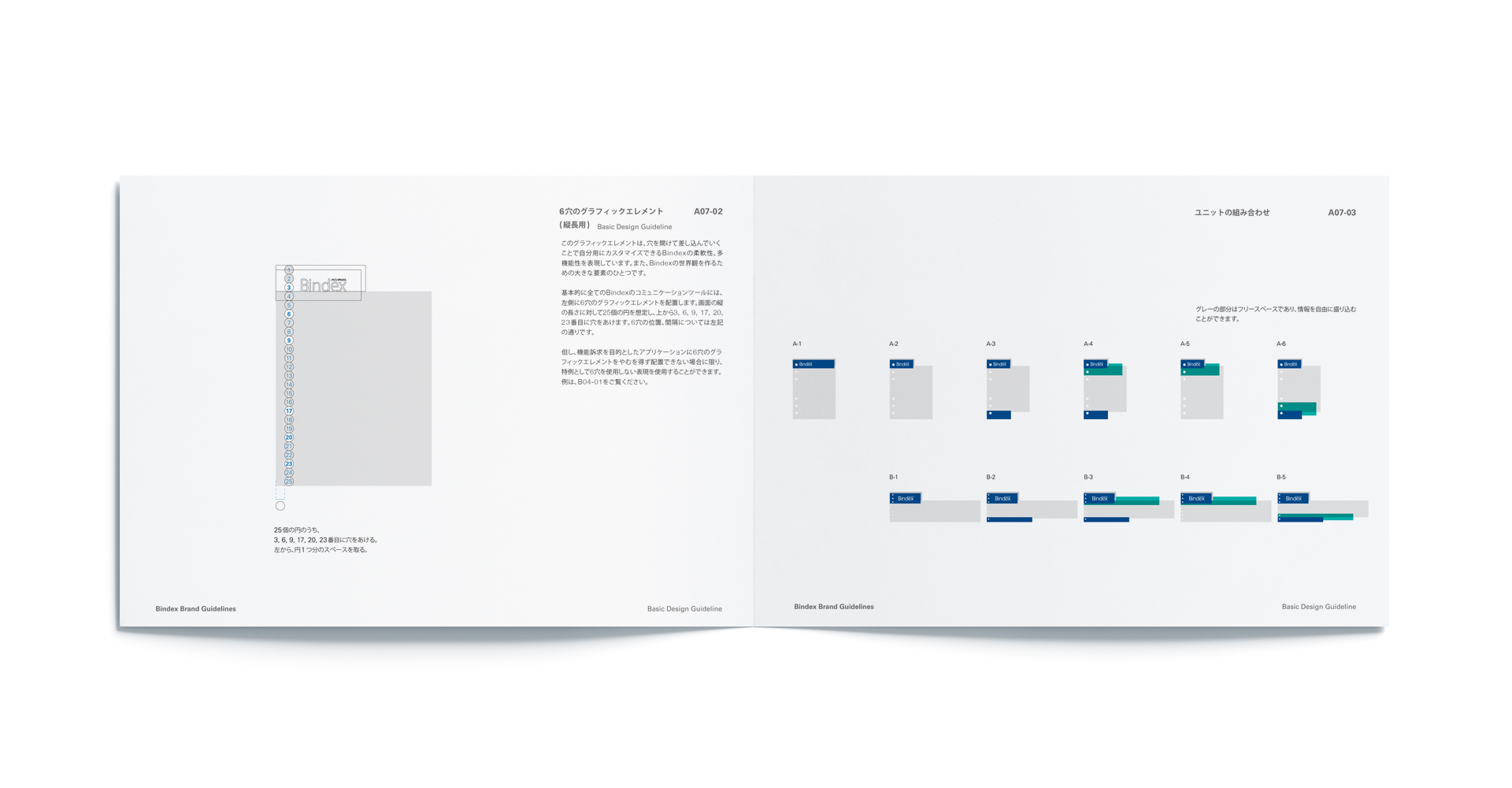
The products are leather-bound with a six-ring loose-leaf binder system with multiple types of refill functions. The ring system and punched hole loose leaf offer users flexibility to customize based on their needs: sections rearranged, dividers added, etc.
This combination of punched holes and loose-leaf, as overlaid areas, are used as design elements. The primary colors for the brand are the clean and cool Bindex blue (PANTONE 288C) and Bindex silver (PANTONE 877 C) to remind users of the planners ring system. An adaptable design system for all Bindex collateral was created for the client.

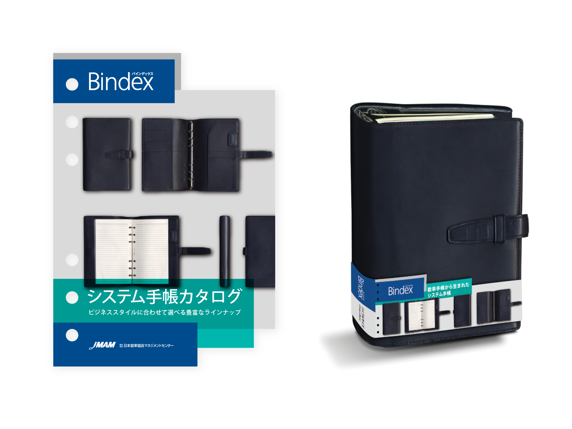
Design samples for product catalog cover and organizer sleeve

Design sample for promotional banner
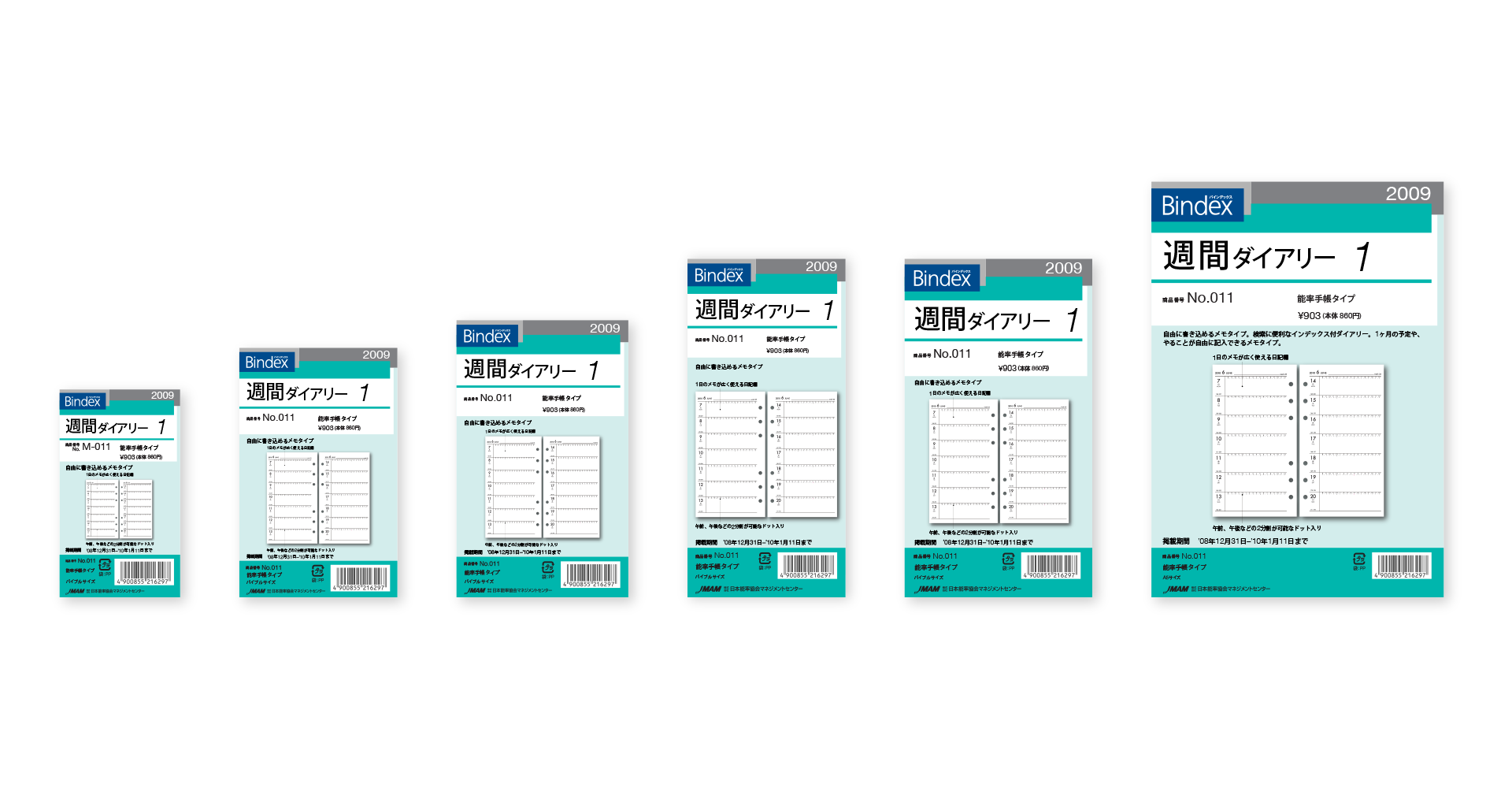
Refill series cover
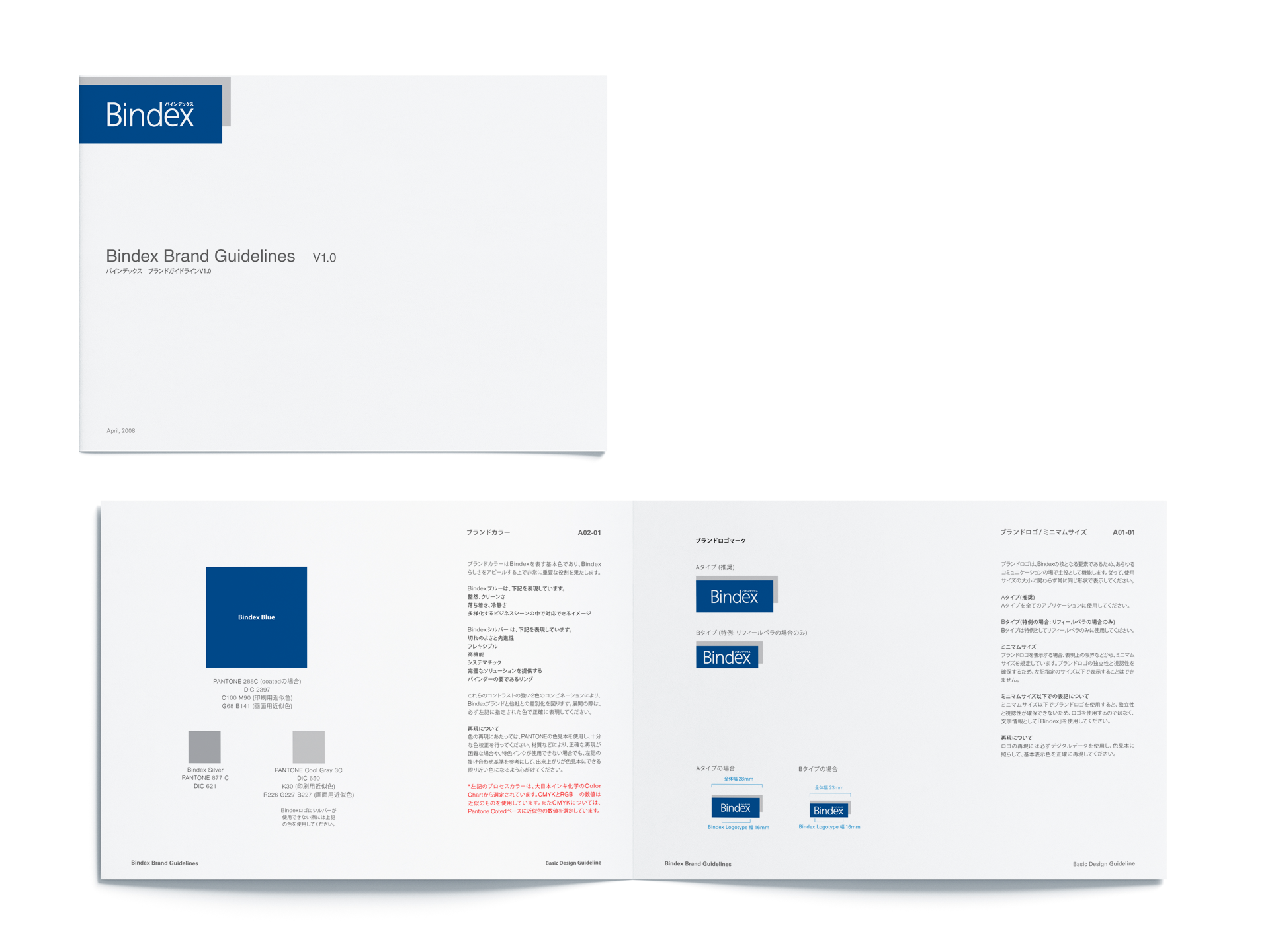
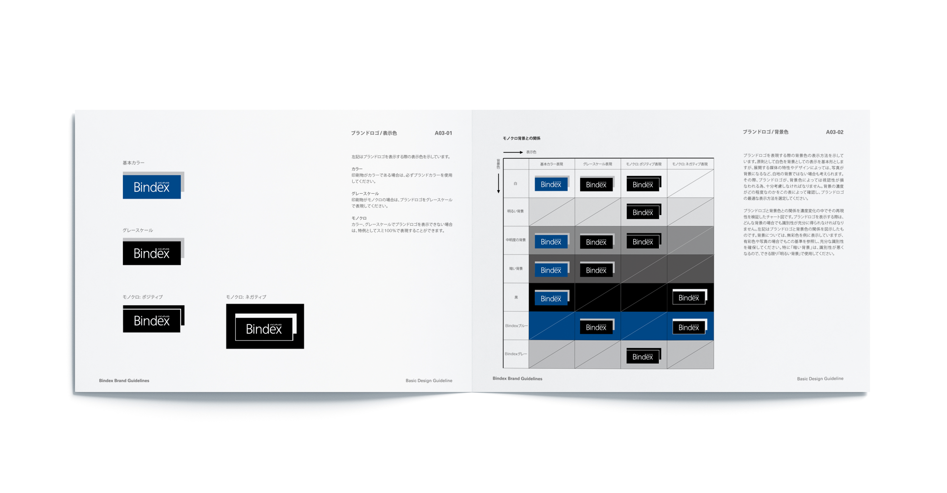
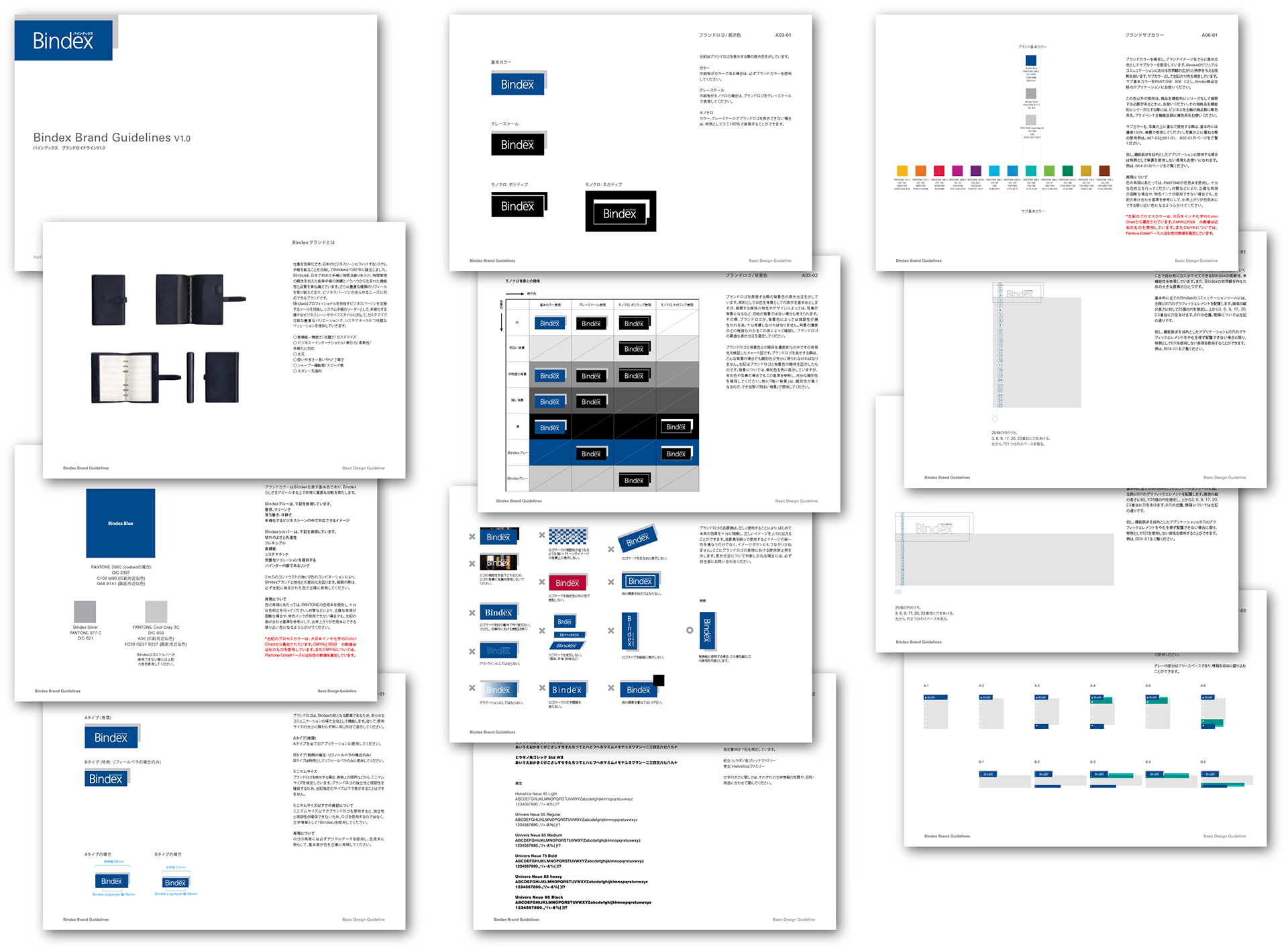
Bindex Brand Design Guidelines